Showing posts with label layers. Show all posts

Monday, May 8, 2017

ABSTRACTS USING THE CROSS SYMBOL

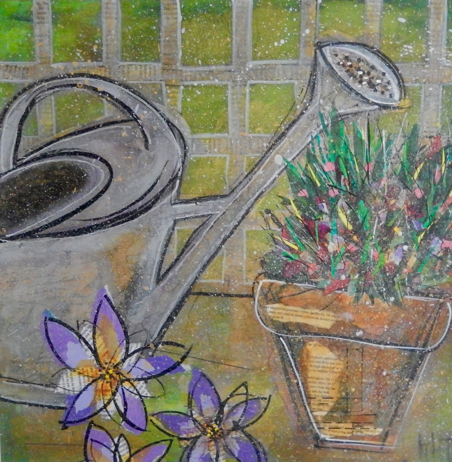
symbolic abstracts on card by Helen Thompson - (each one is 6 " square)

I have discovered the work of Father Bill Moore.  He is an American Roman Catholic priest, who is a trained artist.  He does not sell his work, but creates art for the good of the community.  The link above shows pics of him in his studio, which I am delighted to say, is slightly messier than mine!  I was inspired by his series, 'Embracing the Cross' (small artworks, 5" x 7"),  to produce the samples in the photograph above, for my sketchbook.  I used layers of acrylic paints, inks and collage.

The colour scheme was inspired by my recent walk in a bluebell wood - see April 25th post.  The Rev. Moore uses all sorts of methods to produce textures, and often includes a found object within the work.  As he says, 'they create an energy in the piece that aligns itself with my faith and my theory that all things can be redeemed.'

In his artist statement he states, 'I also love textures to exist in my work, and I often encourage viewers to touch my paintings, because the oil of human hands makes the plastics in the acrylics that I use that much more human. And when you can touch artwork, you develop a viewpoint rarely accessible in the modern art world.' What an interesting artist...


Monday, October 3, 2016

'THE LURE OF THE COAST'

I love meeting abstract artists, as I find the process and results of abstraction fascinating.  During Somerset Open Studios I took advantage of visiting the home and studio of Angela Charles in Crewkerne.


Above and below are samples of her work and there are some photos of her studio below.  The paintings are all in response to the landscape, light and sea on the coast from Dorset to Cornwall.  Angela describes it as 'the lure of the coast' and often takes spontaneous trips there in her camper van to gather material for her works.


Angela uses as a starting point, the pen sketches and written notes done at a location, giving a sense of place and the feelings of being there - although the resulting paintings often bear no resemblance to the original sketches.  She works on spray-primed aluminium or wooden boards, and builds up layers of acrylic paint.  Areas of frantic mark making contrast with smooth, calm sections, which give her work a sense of peace, as well as intensity.

The paintings reflect the landscape, with the wildness of the sea, and the dramatic coastline of the South West.  The more I look at them, the more I see and could easily live with one...    


Tuesday, September 27, 2016

WORKING ON INTUITION!


I  have been trying to do some abstracts from intuition and imagination. These sets of pics show the progression in layers of each one.  Each layer represents a session in the studio, starting from a background layer, which I did not photograph.  The layers, from first to final, are shown from top left in a clockwise order.


I worked on A2 paper (42cms x 59.4cms), mainly in acrylics and oil pastel. I haven't decided what to do with them now.  I might cut them up, especially the one below, and use them as backgrounds for further works or I could mount the whole or part of them, ready to be framed...


I do find it hard to start a piece of work with no idea what the result will be. You have to keep making decisions - colour,  shapes, composition, mood of the piece as you go along!  I have recently been listening to interviews with the artist Robert Burridge.  Before he starts an artwork he writes a page in his sketchbook, listing his concept, colours to be used, composition, title and even what he wants people to feel when they view it!  When things are not going well or he doesn't know how to proceed he can refer to these notes to keep him on track!

I think I am going to try and see if I can get better results...


Monday, June 13, 2016

'ROSES - PINK'


I have just finished this fairly small artwork (30cms x 30cms).  There are a number of layers but I have deliberately allowed the text on the collaged papers to show through. In fact, I felt that the pale pink layer was too opaque so I got the sandpaper out!  As I was working on a wooden panel there was a good firm surface for sanding - I just had to be careful not to sand through the paper layers as well as the paint!


Sunday, May 29, 2016

'IN THE DEEP'


Here is a pic of one of my latest artworks, entitled 'In the Deep' plus some close-ups.  It is on a wooden panel, 50cms x 50 cms, and extends around the sides.  There are a number of layers using various techniques, including collage, printing, splattering, scraping etc.  I used acrylic paints, alcohol inks, decorated papers and oil pastels.

The inspiration was looking down into deep water, with tiny fish and sub-aqua divers producing bubbles underneath.  This is something I frequently do, as I swim in a quarry that is also a dive centre!


Sunday, April 10, 2016

'HIDDEN MEMORIES'


'Hidden Memories' (90cms x 90cms), collage and mixed media on canvas.

I have just finished this large sale commission.  It is to complement another artwork I did 10 years ago, as it is to go on an adjacent wall.  Below is some of the stages it went through.  It is a mixture of collage and mixed media, mainly acrylic and oil pastels.  The papers with text, that I added in a crucifix shape, are photocopies of personal papers supplied by my customer.  Although at the end of the day only the odd word shows through they provide depth and meaning to the picture.  That is why I have called it 'Hidden Memories'...


Thursday, February 11, 2016

'KISSES SENT'


It is always great to see one of your paintings, framed and up in someone's home!  This is one of the large scale black and white abstracts I did when participating on an on-line course tutored by Jane Davies.  It was done on A1 paper and consisted of many layers of acrylic paint applied in a variety of ways.  It is called 'Kisses Sent' and I sent it to near London in a cardboard postal tube!

I was emailed the photograph - I don't remember any pink being in the pic - must be a reflection!  Anyway, it is now framed, hanging in a stairwell of a maisonette, and loved by the home owners...


Sunday, December 20, 2015

COMMISSION COMPLETED!


I have just completed a commission for a couple of pics for a garden room. Both are 50cms square and are done on wooden panels.  They are a combination of collage and painting.  For some of the layers I have used paper printed with text that means something special to the customer.  It is not immediately obvious, but, if looked at closely, words can be made out. Finishing touches included splattering with gold and silver metallic paint and highlighting with white paint.


Monday, August 31, 2015

BIRD FOUND ON WALK


I have just finished this artwork.  It started with a piece of wood I found on one of my early morning walks.  The bird shape struck me immediately.  I made a background for the wood on a 7 x 5 inch canvas board (that had been painted and textured with flower shapes) by attaching layers of torn papers - maps, music, text, my own painted papers and a copy of a landscape photo I had taken on another walk plus gesso and litho coal powder.

An eye was added to the bird and 'feathers' accentuated with gesso and black acrylic.  It was attached to the board which had been signed and varnished. The picture was finally mounted in a painted  frame.


Sunday, April 12, 2015

IS IT FINISHED?


This piece of work had many layers before I finally decided it was finished, (for now anyway)!  I used two of my favourite techniques for getting some of the colours underneath to show through.  They are -  scraping, usually with an old credit card, and scratching through, using an old craft knife.

It is always difficult to know when to stop with a layered piece - you could go on and on adding marks and details, but then there is a danger of losing what you were trying to achieve.  During the layering process there are times when I leave it to dry, or I have gone as far as I have inspiration for.  I then look at it from afar.  Sometimes, I prop it up at the end of my bed so I can wake up to it and look to see what needs to be changed or added. When I can look at it for a long time without the urge to make changes and can't think of anyway to improve it, then I call it resolved.

Sometimes I am not happy with an artwork at all and cannot see a way forward.  In that case, I store it and bring it out, maybe months later, and look at it with fresh eyes.  By then, I have had the experience and techniques of other works, so new ideas often emerge to find a different approach to finish it.


Tuesday, September 30, 2014

SUNFLOWER CANVAS

I am still on the subject of sunflowers!  My sketchbook is filling up fast and here is a small canvas, (30cms x 30cms), that I recently sold in the gallery.


This is a mixed media canvas using mainly acrylic paint and paper.  The leaves are collaged tissue paper which give an interesting texture.  I used purple in the centres of the flowers as it is the complementary colour to yellow.  I felt this gave the canvas an extra depth and lift.  I used printing techniques and my fingers rather than conventional brushes.

Saturday, September 27, 2014

SUNFLOWERS AND POPPIES

I have chosen sunflowers as a subject before. This mixed media artwork on canvas of sunflowers and poppies was bought by a fellow member of the One Craft Gallery co-operative. A section of it is used for one of my most popular printed cards.   It is a long thin canvas ( 80cms x 30cms) and was inspired by a photograph of a huge meadow, full of sunflowers, poppies and other wild flowers which I saw in The Daily Telegraph.  I just loved the bright  happy colours and the abundance of flowers, especially the sunflowers.

Recently I used colour photocopies of photographs of the picture to collage onto the backs of these two bookmarks shown below (on the right).


Monday, August 11, 2014

MORE REMEMBRANCE

Inspired by the poppy installation at the Tower of London (see last post), I have just completed this mixed media artwork on canvas. When I started I had no intention of adding a distressed gold gilded heart outline and the word 'remember',  I just wanted to do a canvas of red poppies.  However, when I had done this it just looked like a rich piece of wallpaper so I felt it needed a focal point and message to add interest.

'Remember' - mixed media on canvas (30ms x 30cms)
This will shortly be added to the poppy window at the One Craft Gallery alongside these two collaged bookmarks that have layers of WW1 imagery and, of course, some red poppies!

Remembrance bookmarks (side1 is on the left)


Tuesday, July 1, 2014

'CATCH A WAVE'

Here is my second abstract on a wooden panel - it is good to have at least two paintings on the go when working with acrylic paints to keep the colours fresh.  When working in layers it is important to let the paint dry before adding the next one so working on another painting is ideal.

After a couple of layers of randomly applying different coloured paints, I started to sort out some large simple round shapes using a graphite stick and then went on to develop it using additional layers of colour - some fluorescent paint was used which was then scraped and sanded until I was happy with the result.  The beauty of working on wood is that it can take rough treatment, such as sanding.

The shapes started to take on the energy of the sea and the colours the excitement of the surf scene so I gave it the title - 'Catch a Wave', a surfing song by The Beach Boys.

'Catch a Wave' - mixed media on board (50cms x50cms)


Sunday, June 29, 2014

FESTIVAL PAINTING

To make a change from all the collages I have been doing recently, I have been concentrating on using mainly acrylic paint. I started two paintings on wooden panels, with no preconceived ideas of how they would end up. I just applied paint and let them develop.

On the one below, the colours and shapes started to suggest something to me - summer festivals. They are on my mind as Glastonbury Festival is on at the moment and I can hear it at night from my home!  So I added some shapes to reinforce the theme, namely triangles and circles. The colours needed some darkness around them so I made the picture a night setting by painting the edges and sides of the panels black.

'Festival' - mixed media on board (50cms x 50cms)


Friday, May 30, 2014

SIMPLE FLOWER CARDS


Continuing the simple flower theme, I designed these greeting cards.  The background was done by collaging torn up sheet music, vintage magazines, old letters and patterned tissue.  I then used layers of gesso to make it more cohesive before cutting out the four card backgrounds.  Each one then had the simple flower shape with leaves, made from various papers, collaged on with matt acrylic soft gel.  Before mounting each one onto plain cream card stock, I outlined them with a shiny gold marker and added gold glitter to the centre of each flower.


Monday, March 17, 2014

MY 'QUOTIES'

I have decided to call my small (10cms x 10cms) mixed media blocks with quotes on them - 'quoties'!  I have just finished the third one.  The other two have featured in previous posts.


The latest 'quotie' was made for a young friend who loves butterflies and the quote, which I saw on Pinterest says, 'never run faster than your guardian angels can fly'.


Friday, March 7, 2014

TULIP TIME

I recently had a fun day in the studio with my friend Penny, an excellent artist who works mainly in oils or watercolours.  Her work can be seen on my blogpost - Friday, May 10th, 2013. She wanted to try some of my collage and layered mixed media techniques.  We both worked to a size of 20cms square.  I worked on a wood panel and Penny used a deep edged canvas. Penny had brought along a photograph she had taken - a cauldron full of colourful tulips. We used this as our inspiration.

Penny's work in progress
At the end of our time together we both had something to show for our efforts.  However, she is taking hers home to finish and I wasn't happy with lower half of my picture so I went back into the studio to work on it some more.  I added a quote suitable for Mother's Day and made some radical changes!

My work in progress.

Finished picture

Monday, February 17, 2014

A MOTHER'S GIFT

It was my mother's birthday at the weekend, so instead of making her a card, I made her this small panel, (10cms x10cms), with a quote as its starting point. It was made on similar lines to the one in the last post. The first layer is old musical scores, as my mother is musical. I added layers of tissue, torn photocopies of my mixed media painting - 'snowdrops', paint, punched and stamped flower shapes.  The quote, which I unfortunately cannot attribute to anyone, is -"Of all the gifts that life has to offer, a loving mother is the greatest of them all." So true.


Thursday, February 13, 2014

TAKE ONE QUOTE

Take one quote, (I have found Pinterest is a treasure trove for this), one small wooden panel (10cms x 10cms),  paper, paint, and voila, here is my latest artwork.  I normally like to attribute quotes to the author, but in this case, I don't know where it originated from, but I think it is a great quote!

'Four wheels move the body, two wheels move the soul' - mixed media collage
I usually work a lot larger, so I find using my usual layering technique on such a small scale quite a challenge. I find it difficult to get sufficient detail in these dimensions. To overcome this problem, I use images from my previous artworks that have been scaled down, and sometimes altered on my computer. They are then printed, cut out and applied to the artwork. In this case, the background is maps of the Lake District taken from an old road atlas, and arrows from old dressmaking patterns and the biker image is from a much larger artwork. I printed the quote out on my computer and went around the edges with a black marker pen before adding with matt acrylic medium.  I splattered the whole thing with metallic gold paint before finishing with a matt UV acrylic varnish for protection.

Although these small wooden panels are designed to hang, they sit nicely on a shelf, so I decided to take the design around the edges and make the back as tidy as the front. It just lacks some of the final layers and images of the front and sides.